
MERCADO LA CANTERA . LA CANTERA FOODMARKET . 拉坎特拉食品市场

Cuando comenzamos a trabajar en este proyecto, el cliente nos mostró un almacén de 8.00 x 40.00 metros, ubicado a dos cuadras de una de las escuelas de música más importantes del país: el antiguo convento de monjas dominicas del siglo XVI de Santa Catalina de Siena y una de las plazas más queridas, bellas, y visitadas de Morelia: Las Rosas.
El cliente quería convertir esa bodega en un mercado gastronómico. Nos gustó la idea, pero sobre todo nos gustó el silencio que se sentía en el interior (cualidad poco común en el centro de una ciudad mexicana). También pensamos que era una buena oportunidad para combinar nuestro lenguaje con las arquitecturas del pasado y para explorar la relación y la dialéctica entre ambos.
A mediados del siglo XVI, esa bodega era el patio trasero de la casa de una familia bien acomodada. Sin embargo, con el paso del tiempo, las reformas, los cambios de propiedad, los diferentes usos del lugar, y algunas modificaciones al edificio hicieron que el espacio perdiera su esencia. El techo estaba cubierto con láminas de aluminio, las paredes de cantera se aplanaron con cemento, y se colocó un piso de mármol y resina... muy característico de los años sesenta. Pensamos que el lugar había perdido su alma. El proceso de diseño comenzó identificando los lugares de comida más populares y concurridos de la zona, y fue fácil descubrir que la gente se reunía para comer en las plazas públicas, ya fuera en un restaurante cercano, en las terrazas, o simplemente en una banca de la propia plaza.
Así, identificamos algunos elementos compositivos de estas plazas: los ejes, las rutas axiales, los volúmenes, el cielo, los árboles, el uso de materiales naturales, y los incorporamos todos. En cuanto a las paredes, las redescubrimos para configurar una atmósfera similar a la de las plazas de modo que los asistentes del mercado se sintieran en un lugar familiar, fácil, y natural.
Todo lo antiguo con valor arquitectónico sería rescatado, y lo nuevo tendría formal y materialmente una naturaleza diferente: una naturaleza blanca y definida que demostraría su propia presencia y su propio momento histórico y conceptual. Con ello, intentaríamos lograr un equilibrio entre lo nuevo y lo viejo.
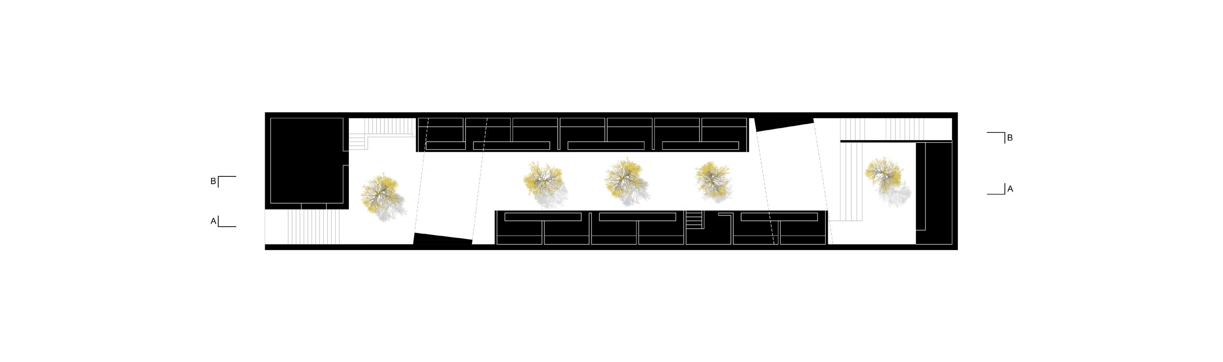
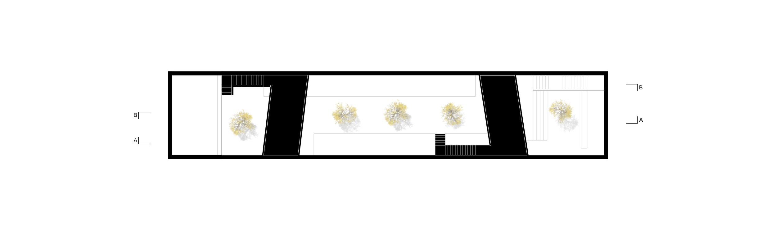
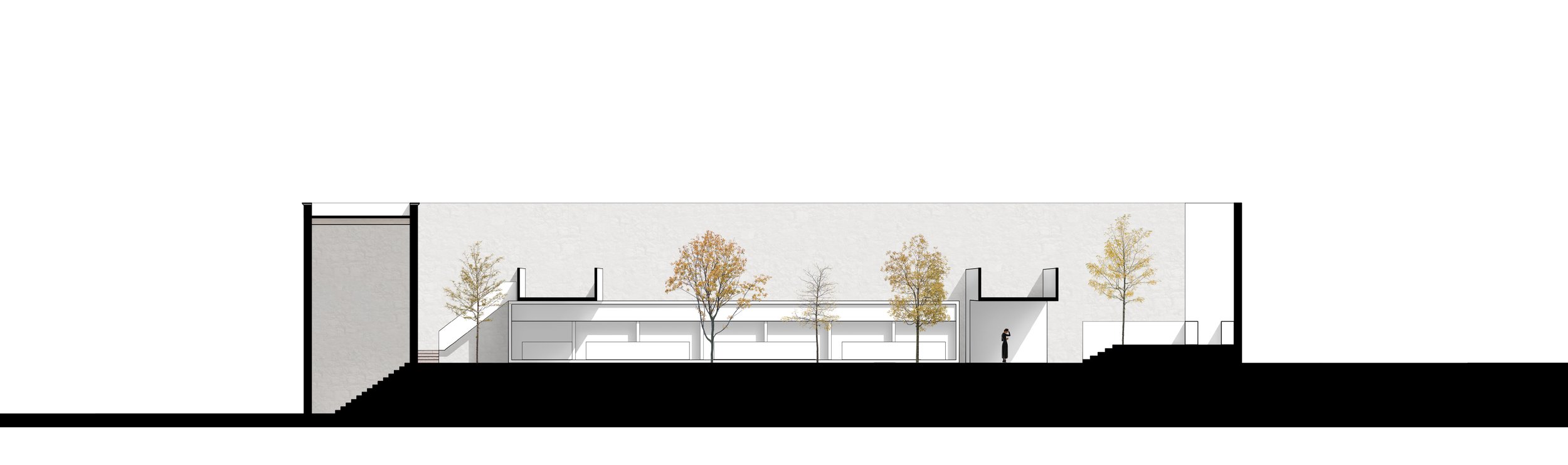
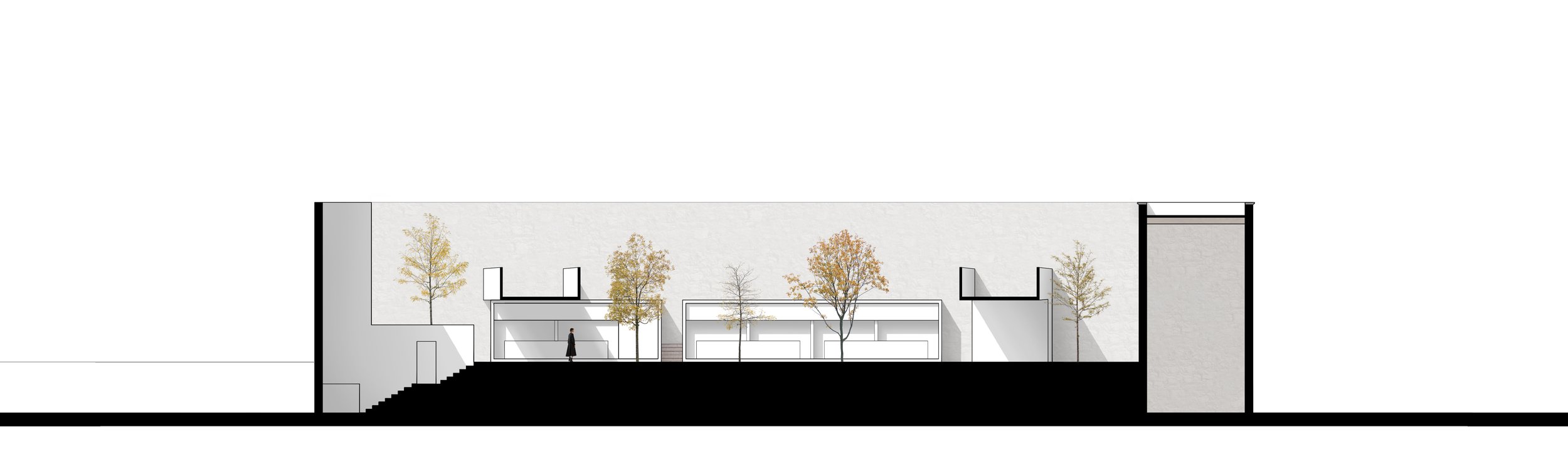
Se dibujó una avenida central arbolada, flanqueada por dos volúmenes longitudinales blancos. Sobre cada uno de ellos se ensamblaron otros dos volúmenes transversales en forma de "L" invertida, que servían para cubrir un área de mesas en la parte inferior y crear terrazas en la parte superior. Sin embargo, su función más importante era la de enmarcar, sin exclusión, las diferentes capas de historia arquitectónica dejadas a lo largo de los siglos. Además, debían entrecruzar la luz y el espacio de forma que se acentuara su presencia y se convirtieran en protagonistas intangibles del lugar.
Fue gratificante descubrir cómo estos elementos simples enmarcaban la arquitectura de los siglos XVI, XIX, XX, y XXI: la jacaranda, la ceniza, el cielo, las torres de la catedral, la pared del fondo, una paloma que finalmente cruza, algún globo que se escapaba de la mano de un niño en la iglesia. Sin tratar de ser exagerado ni melodramático, parecía que todo encajaba en esos marcos; todo el universo nos permitía expresarnos.
-
When we began to work on this project, the client showed us a of 8.00 x 40.00-meter warehouse, located two blocks from one of the most important music schools in the country: former convent of XVI Century Dominican nuns of Santa Catalina de Siena, and one of the most beloved, beautiful, and visited squares in Morelia: Las Rosas.
The client wanted to turn that winery into a gastronomic market. We liked the idea, but we mostly liked the silence felt inside (uncommon quality in a Mexican city’s downtown). We also saw a good opportunity to combine our language with the architectures of the past and to explore the relationship and the dialectic between both.
In the middle of the 16th century, that cellar was the backyard of a wealthy family’s home. Over time, however, reforms, ownership changes, different uses of the place, and alterations in the building caused the space to lose its essence. The roof was covered with aluminum sheet, the quarry walls were flattened with cement and a floor made of marble and resin was placed... very characteristic of the 1960s. We thought that the place had lost its soul. The design process began by identifying the most popular and crowded food places in the area. It was easy to find out that people gathered to eat in public squares, either in a nearby restaurant, on the terraces, or simply on benches in the middle of the squares.
Thus, we identified some compositional elements of these places: the axes, the axial routes, the volumes, the sky, the trees, the use of natural materials, and we incorporated them all. As for the walls, we uncovered them to create a similar atmosphere as in the squares, so that market attendees felt in a familiar, easy, and natural place.
Everything antique with architectural value would be rescued, and everything new would formally and materially have a different nature: a white and defined nature that would demonstrate its own presence and its own historical and conceptual moment. With this, we tried to achieve a balance between the new and the old.
A tree-lined central avenue was drawn, flanked by two white longitudinal volumes. On each of these, two other transversal volumes were assembled in the form of an inverted "L", which served to cover an area of tables at the bottom and create terraces at the top. However, their most important function was to frame, without exclusion, the different layers of architectural history left over the centuries. Also, they were meant to intersect light and space in a way that their presence would be emphasized, and they became intangible protagonists of the place.
It was gratifying to discover how these simple elements framed the architecture of the 16th, 19th, 20th, and 21st centuries: the jacaranda, the ashes, the sky, the towers of the cathedral, the back wall, a dove finally crossing over, some balloon escaping from a child at the church. No intention to be exaggerated or melodramatic, but it seemed that everything fit within those frames; the whole universe allowed us to express ourselves.
-
当我们开始做这个项目时,客户向我们展示了一个8 x 40米的仓库,这里离该国最重要的音乐院校之一只有两个街区之遥,即前圣卡塔琳娜·德·锡耶纳16世纪多米尼加修女的修道院,以及莫雷利亚最受欢迎、最美、最受欢迎的广场之一。
拉斯罗萨斯
客户想把那个酒厂改造成美食市场。我们喜欢这个想法,但我们主要是喜欢里面的安静感觉(在墨西哥城市的市中心是不常见的品质)。我们也看到了一个很好的机会,把我们的语言和过去的建筑结合起来,探索两者间的关系和辩证关系。
在16世纪中期,那个地窖是个富裕家庭的后院。然而,随着时间的推移,改革、所有权的变化、地方的不同用途以及建筑的改变使这个空间失去了其本质。屋顶覆盖了铝板,采石场的墙壁被水 泥压平,放置了大理石和树脂制成的地板 …… 非常具有20世纪60年代的特点。我们认为,这地方
已经失去了它的灵魂。
设计过程从确定该地区最受欢迎和最拥挤的食物场所开始。很容易发现,人们聚集在公共广场上吃饭,要么在附近的餐厅,要么在露台上,或者干脆在广场中间的长椅上进食。
因此,我们确定了这些地方的一些构成元素:轴心、轴线、体量、天空、树木、自然材料的使用, 并将其全部纳入。至于墙壁,我们将其揭开,以创造与广场类似的氛围,使市场参与者感到身处 一个熟悉、轻松和自然的地方。
所有具有建筑价值的古董都会被抢救出来,而所有新的东西在形式上和物质上都会有不同的性质: 一种白色的和确定的性质,将展示自己的存在感和自己的历史和概念的时刻。借此,我们试图实 现新旧间的平衡。
画出一条绿树成荫的中央大道,两边是两个白色纵向体。在这两个体块上,另外两个横向体以倒"L"的形式组合在一起,在底部覆盖一个桌子区域,在顶部形成露台。然而,它们最重要的功能 是无排斥地框住数个世纪以来留下的不同层次的建筑历史。此外,其目的是以一种强调其存在的方式将光线和空间交汇在一起,并成为该地方的无形主角。
令人欣慰的是,我们发现这些简单的元素是如何构筑起16世纪、19世纪、、20世纪和21世纪的建筑的:槐树、灰烬、天空、大教堂的塔楼、后墙、一只鸽子最终穿越了,气球从教堂里的孩子手中逃脱。无意夸张或做戏剧效果,但似乎一切都符合这些框架;整个宇宙允许我们表达自己。


MERCADO VIDEO